Showing posts with label layering stencils. Show all posts

Wednesday, 17 October 2018

Beware! Mid month inspiration for That's Crafty 'Spookilicious challenge.

Hi Everyone and Welcome 

Hope you are all doing good and are having a great week so far.
I've been busy creating my latest projects for That's Crafty- one I am sharing here today, the other will be over on That's Crafty blog tomorrow.
The current challenge theme at That's Crafty is 'Spookilicious' and as we are half way through the month the Design Team and Guest Designers are today sharing another piece of creativity inspired by the theme. 

Here's my Spookilicious Art panel featuring That's Crafty 'Drippy Skull' stencil 
This began life as a 'test run' trying out the stencil with texture paste, working on a blank sheet of mixed media paper taken straight from the pad. I wasn't sure where I was going with it or indeed if  I was going to use it so I it sat waiting in my W.I.P pile while I wondered........
It was while I was working with alcohol inks that it caught my eye again and so taking the stenciled piece I 'mopped' up the alcohol inks I had on my mat at the time. As I'd used mixed media paper and not yupo the paper absorbed the ink so the colours weren't as intense but they added some necessary colour to get the creativity flowing.
Its a shame I failed to take a photo at this stage as you would be able to see what I mean so much better with a visual.
Using some of the 'mopped up' alcohol ink colour tones as a guide I stengthen their intensity with distress inks applied with a blending tool so the panel had full colour coverage.
I felt the texture paste skull needed to be darker so I repositioned the stencil and heat embossed it with black embossing powder- much better! 
 I added background detail using stamps with Archival ink both around the edges of the panel 
(the branch - Tim Holtz Mr Bones stampset
and in and around the skull (text stamp from Tim Holtz Undertaker stampset).
I also added some background stenciling ( Tim Holtz Dot Fade leyering stencil)
some white highlights in the relevant places and of course some painty splatters!
 I'm not a  big fan of high gloss but I do think the skull is rocking the look!
 The four sides and corners of the panel were also heat embossed with black EP and the panel was spritz with Cosmic shimmer spray - the lens hasn't picked up the 'glisten' too well but you can see a few golden speckles if you look ever so closely.
Finally came the words: 'Beware!' (Tim Holtz Mr Bones Stampset) and 'creepy, kooky freaky spooky'
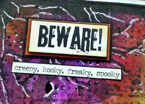
'chills and thrills' (Tim's small talk stickers). Thought they kinda suited!
The panel is mounted on white cardstock, kraftcore shattered collection and finally black mountboard to give it rigidity to display.
I hope I have offered some mid month inspiration with my Spookilicious 'Beware!' Art panel. 
Full challenge details can be found over at That's Crafty along with a gallery of Spooky projects created by the Design Team 

I will be back tomorrow with a sneak peak of the weekly project I mention at the start of this post so hopefully I will see you then and be able to tempt you over to That's Crafty's weekly blog to see the project in full. 
Thank you so much for stopping by today, for your follows and for your kind comments. 
All are very much appreciated. 
Wishing you all a wonderful day 
Take care 
Amanda 
x

Friday, 4 August 2017

Watercolour! - A Vintage Journey August 2017 Challenge

Hello Everyone and Welcome

Its great to see you all again. Today we launch our new Challenge over at A Vintage Journey and this time I will be your host for our 'Watercolour' challenge. Here are the details
' There is so much versatility in watercolour, making it possible to create art that can be gentle , washy and light or bold, full of colour and with definite lines and it comes in a variety of guises: pans, tubes, sticks, inks , markers, crayons. So for this challenge we would like your projects to include some form of watercolouring or watercolouring techniques and be in keeping with our favoured styles: vintage, shabby, mixed media. art journaling, industrial, timeworn or steampunk .'

I guess my arty/ creative roots began with pencil drawing and painting, watercolours being my painting medium of choice and I have been wanting to revisit those roots for a long while now but have kept putting it off, shying away from it due to self doubt in my ability, I think, so I saw this challenge as a golden opportunity to rekindle my much neglected love of drawing and painting. I dug out my watercolour paints and brushes of yesteryear and combined them with some of my more modern day crafty mediums/ supplies to create a more contemporary watercolour painting with a mixed media twist.

Alot of watercolour artists often work from photos/ pictures to develop , hone and practise their skills especially if they aren't, for whatever reason, able to paint 'live' so given it had been so long since my last endeavours and not wanting to knock my confidence I decided to do just that so the image is sketched and painted from a picture I came across in one of my 'art inspiration' files.

I began by stretching my paper (300gsm) onto a drawing board. This gives you a tough, resilient surface on which to paint and helps the paper remain flat both during and after painting. I'm sure all you artists out there know how to do this but for for those of you who don't here's how:
1.First soak the paper in water. After 5/10 mins tip the paper to drain off as much water as possible 2.Lay the paper on a drawing board , making sure the paper doesn't buckle or fold.
3. Using Gummed paper tape (not masking tape) adhere the paper to the drawing board keeping it flat and smooth whilst adhering.
4. Leave to dry
Note: craft watercolour cardstock didn't take kindly to being stretched . It buckled at step 1! Worth bearing in mind when choosing your watercolour substrate .

I was then all prepped so gathered my pencil, watercolour paints, brushes and some artists masking fluid and set to work.

I sketched out the image in pencil and then painted the Artists blue mask in any areas I wanted to remain white once the painting was finished. The mask rubs away very easily by finger. Its the first time I have tried this product and have to say I was impressed. Tim Holtz distress glaze, I'm sure, would do a very similar job.
The deep red lips/ mouth show off the use of the masking fluid very well.

I used tones of blue throughout the painting with subtle hints of purple here and there. I have a deep love of eyes . They are without doubt the 'windows to the soul' and for me they speak volumes . Though I have pencil sketched eyes before I have never really tried painting eyes so this was my first attempt and I have to say I wasn't too disappointed with these baby blues....

Once I'd finished painting I added some texture around the focal image using Ranger Opaque texture paste through Tim Holtz dot fade stencil. I blended distress ink over the textured stenciling and around the edges of the paper

before adding a touch more detail using stamps with archival ink

I mounted the painting first onto card stock and then onto a 8x8 canvas which I'd delicately coloured around the edges with a watercolour paint wash.
Bead topped hex nuts helped finish off two of the corners

and I added a few 'words' all thanks to a Tim Holtz small talk sticker adhered to the reverse of a quote chip.

I am pleased I have tried my hand at watercolour painting again, whether I worked wonders with them, well, I'll let you be the judge of that but at least, after almost 25 years ( hangs head in shame) I have taken the first step and rekindled the fire.

I hope my mixed media watercolour painting along with all the fabulous projects created by some of my Fellow Creative Guides , which can be seen here at A Vintage Journey will inspire you to go create yourself and join us in our Watercolour Challenge .
As always at the end of the challenge there will be one lucky winner chosen by Random. Org who will receive our Sponsors Prize which this month is a £20 Gift card , generously donated by
Craft Obsessions

The Creative Guides also choose 3 Pinworthy Winners who will win a Pinworthy badge to display on their blog and an invite to join us as a Guest Designer for a future Challenge.


I would like to enter this into the following challenges : 
Stamps and Stencils: Technique School  
Technique- stretching the watercolour paper
Thats Crafty: Anything but Cards
The Craft Stamper TIMI Challenge:August , Anything Goes Stamping Challenge
background stamping detail 

I hope you have enjoyed your time here today - thank you so much for stopping by.
I really do appreciate all your visits, comments and follows.
Wishing you all a lovely weekend
Take care and keep on the happy side
Amanda
xxx

Monday, 26 September 2016

Tim Holtz 12 tags of 2016= September - Take Two

Hello and Welcome Everyone

Some of you maybe meeting me having just seeing the first tag I have blogged  for Tim Holtz 12 tags of 2016- September and for others of you it maybe your first stop by my blog today and you won't yet have seen the first tag. So for those of you who haven't seen Tag 1 here's the link and you will see the post and tag I am referring to.
So this post is all bout my take 2 version of Tim's September 2016 tag . As mentioned previously Tim's September tag and tutorial can be found here , well worth the extra click to see the master himself creating this months fabulous tag .
Following the same format as the blog post for Tag 1 here is my Tag 2 version of Tim Holtz 12 tags of 2016- September this time using the other of the two stamps from the stamp set 'Evolution' .

The distress paint patina tag using the same distress paints as for Tag 1: Salty Ocean, Mermaid Lagoon, Broken China, Twisted Citron, Forest Moss, Tarnished Brass and Antiqued Bronze.  I love how you never get the same results twice even when using the same combination of colours .
The alcohol ink resist panel again using the same alcohol inks as for Tag 1 - Pitch Black, Mushroom and Stream .
and just a few close ups of all the ideology embellishments- long fasteners (hammered) mini gears and an Alpha part word - 'Remember' ! (no shrivel this time hahaha)
some film strip, eyelets, a sprocket gear, a vial sticker, remnants rubs and some stitching.
and once again here is my Tag 2 version of Tim Holtz 12 tags of 2016 September
Just as I always do I have thoroughly enjoyed creating both tags (tag one can be seen here). I echo the words of thanks to Tim that I express on my previous post - thanks to you Tim for providing the continual creativity and inspiration that you do - it really is priceless!

Huge thanks goes out to all of you too who have spent time with me today and endured not one but two posts . I really do appreciate it .
Look forward to seeing you all again soon but in the meantime
take care
and
 keep on the happy side
Amanda
xxx

Tim Holtz 12 tags of 2016 - September Take One

Hello Everyone and Welcome

Hope you have all had a lovely weekend and are all refreshed and fully charged for the week ahead. I got to spend some of my weekend with Tim ... well ok I'm hypothetically speaking of course but hey this girl can dream !!
Yep, I've been busy creating my take on Tim's September 2016 tag and am here today to share the results of my creativity. You can see Tim's September tag and how he created it here and as ever the master of his craft Tim explains everything so well in his tutorial there really is no need for me to go into any great detail.
So here is my FIRST take on Tim Holtz 12 tags of 2016- September ( Take TWO can be found here ) .
The distress paint patina tag - Distress paints used : Salty Ocean, Mermaid Lagoon, Broken China, Twisted Citron, Forest Moss, Tarnished Brass and Antiqued Bronze .
The alcohol ink resist panel - inks used : Pitch Black, Mushroom and Stream .
and just a few close ups of the ideology embellishments: long fasteners, mini gears (hammered) , remnant rub and Alpha parts. I set out using 'Documented' as my chosen Alpha part and had what I shall call 'a moment' and used heat to dry the paint!!! Needless to say there was some serious 'shrivel ' going down so have used 'This is life' instead . I think it works well though with the evolution man .
 a game spinner.,some film strip, eyelets, a star charm, a vial sticker and remnants rubs and some stitching.
Once again here is my first take on Tim Holtz 12 tags of 2016 September
.
As always big thanks to you Tim for providing the monthly creative inspiration to get inky trying out both new and old techniques . Making my monthly tag/s is something I always look forward to and this one was no exception . Can't wait for the next one !!
Thanks to you all for stopping by today there. Your visits, followers and comments are always welcome and much appreciated .
I'm heading over to Tag two now - hope you will join me there
See you again soon
Take care
and keep on the happy side
Amanda
 xxx

Friday, 1 July 2016

Monochromatic- A Vintage Journey- July 2016

Hello Everyone and  Welcome
Hope you are all doing ok  and are all set for the start of a new challenge over at A Vintage Journey. Yes, believe it or not, another month has passed ( the clock just seems to be ticking so quickly this year) and its time to launch July's theme 'Monochromatic' hosted by Tracy. Heres what Tracy has to say
'I love Monochromatic themes in my artwork. I love the balance dlook it gives to a design. If you ever struggle with knowing what colours to usethis should be right up your street, one colour alone or hues of one colour(plus black and /or white- simple! Please just check that your entry is vintage, shabby, mixed media, art journalling, industrial, or steampunk to be in with a chance  of being a winner or a pinworthy mention .'
For my Monochromatic project I have drawn initial inspiration from a painting by Belgian Surrealist Artist Rene Magritte, The son of man and created a piece of wall art using some of Tim Holtz 2016 CHA new release products.
I have remained true to my love of the classic monochrome palette of black, white and grey/ silver. Admittedly my finished piece is more 'real' than 'surreal but that's where my creative muse led me- this time... 
Unfortunately I forgot to take a comprehensive set of step by step photos but I can provide you with the details of techniques/products used. 
So lets begin
I created a mask for the moon using a circle die. This was positioned and adhered to a pre-cut white card panel and remained in place until the background was complete, after which it was removed to reveal the moon.  
 Tim Holtz Wrinkle free Distress technique using Distress inks provided an initial layer of colour. More colour was then added using the distress inks with a blending tool.
Now to add some detail
That included some background stamping and whilst the jet black Archival ink was to hand the Evolution Man(as I am calling him) was stamped onto a separate piece of white card stock and cut out ready to position in place later
and some distress ink stencilling aswell as gesso stencilling for some added texture.
With the products and techniques covered time for some photos of the background panel
The gesso stencilling was enhanced with touches of silver gilding wax.
Some picket fence distress paint splatters made an appearance too. You know I love my splatters!
Moving onto the wood panel ....
This was cut to size by my new 'mate' at the local building merchants. I had a few panels cut at the same time, various sizes and they were unbelievably inexpensive costing little more than a standard chocolate bar here in the UK .So its worth checking out if you have any similar merchants in your area as those pennies saved on pricier shop bought mdf panels goes towards more craft supplies, right?
After sanding back the edges the panel was primed with gesso and then finger painted with Distress paints and Gesso. The corners and along the sides of the panel were crazed with Distress crayons blended into the crazing.
A couple of ideology arrows were added to the finished panel. 
Why arrows? Well lets see if I can share my thoughts : The arrow is a symbol of direction/movement/progress. Man is at the point of the arrow- the pinnacle of Evolution but in this ever increasing digital age will man be pierced by the arrow as it progresses further into the future?
Only time will tell I guess!

I hope my piece of wall art along with the fabulous projects offered by my fellow Creative Guides(which can be seen here at A Vintage Journey) will inspire you to go create and join in this months 'Monochromatic' fun.
I would like to enter this  into the following challenges 
Country View Crafts-July Challenge- Have fun with Circles  
Thats Crafty- Masculine Challenge 
The Craft Stamper- Take it Make it Challenge- July  - Take a Stamp: Anything Goes
That just leaves me to Thank you all for stopping by today.
 As always your follows, visits and comments are much appreciated and extremely valued. 
Hope you all have a lovely weekend 
Take care  
Amanda 
xxx

Saturday, 28 May 2016

12 Tags of Tim Holtz - May 2016

HI Everyone and Welcome 
Hope you are all enjoying the weekend so far and the sun is shining down on you all.  I'm set to head back to my 'happy 'place ( Craft HQ) today but before I do I would like to share with you my take on Tim Holtz 12 tags of 2016- May.
You can see Tim's tag for May here and as you will see I have mixed things up a little- not with the techniques they remain the same, primarily with the stamps. I don't yet have the Lady Rose stamp set so I have had to use an alternative and that has then influenced the colours, stencils and dies I have used.
So the stamp set I have used is 'Roadtrip'. It was a real 'must have' set when I first saw it as I have always dreamed of one day traveling down Route 66 in the U.S.A on a Harley Davidson! Alas, it is still just that - a dream but at least now I have this tag to keep the dream alive.
and a a few close up .... 
the tissue tape resist technique which not only is a great technique but also provides the 'white' for my red, white and blue American colour scheme. (Fired Brick, Salty Ocean distress spray stains). I also added a sticker and some remnant rubs befitting of my tags theme.
I used Tim's  'Traveller' layering stencil, and Tim's new gearhead thinlit dies. I cut the gears out twice and adhered them together to create thicker gears that would give some dimension when adhered to the tag. 
Another gear with brad, ideology arrow, Pewter distress spray stain and silver gilding wax provide the metallic touches 
and of course the Route 66 road sign.
Here it is again - my take on Tim's tag for May 2016
 Thanks again Tim for yet another great tag full of creative inspiration. Life just wouldn't be the same without a monthly Tim tag to make .
As you've probably guessed I will be entering this into 
Tim Holtz 12 tags of 2016- May 
and I would also like to enter this into the following challenge
 Frilly and Funky Challenge - Oh The Places You'll Go!  
 Time now to head back  to my 'happy place' and see where my creative muse takes me . 
Thank you so much for taking time out this holiday weekend to stop by. I do appreciate it, as I do your comments and follows. 
Hope you all have a lovely weekend
Take care 
Amanda
 xxx