Tuesday, 26 July 2016

Tim Holtz 12 tags of 2016- July

Hi Everyone and Welcome
Apologies again - I really must kick this lack of blog posts into touch ....I can't say lack of creativity as there has been lots of that going on but its all in prep for you to see in future posts. I have to confess though as the Mercury soared here in the UK during the last couple of weeks I did indulge in some 'rays', much needed Vitamin D and happy 'vibes' the Sun was so generously offering.
Today though here at Ink-A- Pink  its time to forget the summer holiday/ vacation season and think more about the winter holiday season as I am sharing my take on Tim Holtz 12 tags of 2016 - July. I have followed Tim's tutorial and techniques (which can be found here) but changed it up a little due to my craft stash lacking in some of the supplies Tim used on his.
I also have an added extra for you too as I made 2 tags - kind of a 'buy one get one free' hahaha.  Actually I made 3 but the third has yet to be finished! After much thought I have decided to blog them as two separate posts (making up for the recent lack of posts) so here's the link for one of them and here's the one I am sharing on this post
I used Tim's Stampers Anonymous Christmas Blueprint 2 stamp set and Festive Berries, Fired Brick, Scattered Straw, Walnut Stain and Ground Espresso Distress markers and inks to watercolour paint and distress, creating a resist with the Distress Micro Glaze. Thanks Tim for the reminder that I NEED to use this product more often.
The words are created using Tim's Sissix Handwritten Holidays thinlit dies and Holiday Words Thinlit dies. I also used a gold pen to add highlights to the word 'Christmas'. Love how this makes it 'pop'
I like to seal and finish off the hole on my tags with an eyelet- in this case gold. The hanging snowflake was originally silver/pewter but gold alcohol ink soon changed the 'Ag' to 'Au'! Notice the liquid pearl drops on the neck of the bauble and of course the paint splatters. Oh I do love my splatter brush! Tim's new Distress Mica sprays give the image a delicate shimmer - you're gonna have to trust me on this one as the lens has failed me..... again!
Three of the five star fasteners were altered with gold alcohol ink to compliment the gold snowflake and a micron Archival ink pen provided the faux stitching. (my sewing machine decided to throw a 'wobbler'- its now sat on the naughty step)  
And here is one of the two tags I have created for Tim Holtz 12 tags of 2016- July. 
As always I loved creating this months tag, so much so I made and finished two - be sure to check out my other one here! Maybe you could let me know which one you prefer as I couldn't decide but no surprises there really as I am the 'Queen of Indecision'! 
Thanks Tim, yet again, for another month of creative inspiration. Life sure got a whole lot happier with a monthly Tim tag to make.
Time now to go link this up and then head on over to hopefully meet you on the flip side to share details of my other Tim tag for July 2016. 
Thanks as always for your visits, comments and follows. I really do appreciate them and each and everyone of you. 
See you real soon 
Take care 
Amanda 
xxx

Friday, 1 July 2016

Monochromatic- A Vintage Journey- July 2016

Hello Everyone and  Welcome
Hope you are all doing ok  and are all set for the start of a new challenge over at A Vintage Journey. Yes, believe it or not, another month has passed ( the clock just seems to be ticking so quickly this year) and its time to launch July's theme 'Monochromatic' hosted by Tracy. Heres what Tracy has to say
'I love Monochromatic themes in my artwork. I love the balance dlook it gives to a design. If you ever struggle with knowing what colours to usethis should be right up your street, one colour alone or hues of one colour(plus black and /or white- simple! Please just check that your entry is vintage, shabby, mixed media, art journalling, industrial, or steampunk to be in with a chance  of being a winner or a pinworthy mention .'
For my Monochromatic project I have drawn initial inspiration from a painting by Belgian Surrealist Artist Rene Magritte, The son of man and created a piece of wall art using some of Tim Holtz 2016 CHA new release products.
I have remained true to my love of the classic monochrome palette of black, white and grey/ silver. Admittedly my finished piece is more 'real' than 'surreal but that's where my creative muse led me- this time... 
Unfortunately I forgot to take a comprehensive set of step by step photos but I can provide you with the details of techniques/products used. 
So lets begin
I created a mask for the moon using a circle die. This was positioned and adhered to a pre-cut white card panel and remained in place until the background was complete, after which it was removed to reveal the moon.  
 Tim Holtz Wrinkle free Distress technique using Distress inks provided an initial layer of colour. More colour was then added using the distress inks with a blending tool.
Now to add some detail
That included some background stamping and whilst the jet black Archival ink was to hand the Evolution Man(as I am calling him) was stamped onto a separate piece of white card stock and cut out ready to position in place later
and some distress ink stencilling aswell as gesso stencilling for some added texture.
With the products and techniques covered time for some photos of the background panel
The gesso stencilling was enhanced with touches of silver gilding wax.
Some picket fence distress paint splatters made an appearance too. You know I love my splatters!
Moving onto the wood panel ....
This was cut to size by my new 'mate' at the local building merchants. I had a few panels cut at the same time, various sizes and they were unbelievably inexpensive costing little more than a standard chocolate bar here in the UK .So its worth checking out if you have any similar merchants in your area as those pennies saved on pricier shop bought mdf panels goes towards more craft supplies, right?
After sanding back the edges the panel was primed with gesso and then finger painted with Distress paints and Gesso. The corners and along the sides of the panel were crazed with Distress crayons blended into the crazing.
A couple of ideology arrows were added to the finished panel. 
Why arrows? Well lets see if I can share my thoughts : The arrow is a symbol of direction/movement/progress. Man is at the point of the arrow- the pinnacle of Evolution but in this ever increasing digital age will man be pierced by the arrow as it progresses further into the future?
Only time will tell I guess!

I hope my piece of wall art along with the fabulous projects offered by my fellow Creative Guides(which can be seen here at A Vintage Journey) will inspire you to go create and join in this months 'Monochromatic' fun.
I would like to enter this  into the following challenges 
Country View Crafts-July Challenge- Have fun with Circles  
Thats Crafty- Masculine Challenge 
The Craft Stamper- Take it Make it Challenge- July  - Take a Stamp: Anything Goes
That just leaves me to Thank you all for stopping by today.
 As always your follows, visits and comments are much appreciated and extremely valued. 
Hope you all have a lovely weekend 
Take care  
Amanda 
xxx

Tuesday, 28 June 2016

12 tags of Tim Holtz - June 2016

Hello and Welcome
Sorry for my recent lack of blog posts but thank you for hanging in there and being here with me today as I share  my version of Tim Holtz 12 tags of 2016- June.
I have followed Tim's excellent tutorial (both tag and tutorial can be found here) but I have given my tag a real American 'Stars and stripes' theme. Well with the 4th of July - Independence day less than a week away I thought why not?
and here it is
I used the stars stamp from Tim's 'Rockstar' stamp set to add detail to the plain tissue wrap for the background. To the right I stamped rows of 'u' 's' and 'a' using the long alphabet stamp from Tim's 'documented' stamp set
I chose to use a stamp rather than a stencil for the stripes inking the stamp with Distress ink, spritzing with water and then stamping onto Woodgrain paper stock -love the way the Woodgrain creates great textured lines.
I was able to add some stitching having set up my sewing machine recently - that was fun even if I am a little unpractised. I adhered a memo pin behind a number token to embellish one side of the tag . The number is highlighted with white distress crayon
Tim's occasions small talk stickers provide the sentiment  and notice Uncle Sam's black gem buttons and silver and red rose buttonhole! 
not forgetting the hanging star studded heart!
and once again my Stars and stripes tag in all its glory! God bless America. 
As always I really enjoyed creating this months tag, probably more so as my dear American friends and family were close in thought throughout.
Thanks Tim for all you do to nurture my inner creativity and for endlessly inspiring! 
Time now for me to go link this up to 
so for now I will love you and leave you and hope to see you all again soon . 
Thanks for all your visits, follows and comments - they are always appreciated . 
Take care 
Amanda 
xxx

Friday, 3 June 2016

Embossing Pastes/ Texture - A Vintage Journey - June 2016 Challenge

Hello Everyone and Welcome
Hope you are all doing good and have enjoyed a great week. 
As the month of June begins so does a new challenge over at A Vintage Journey. Lovely Astrid is the host this month and her chosen challenge is 'Embossing Pastes/ Texture
This is what she says :
'Use any kind of texture paste, homemade, crackle, coloured or plain on your project . There is an endless variety available so play, have fun and apply it to your hearts content. Use it through stencils, randomly or in whatever way you want but remember it should be in one of the vintage, shabby, mixed media, art journaling industrial or steampunk styles that we favour. Put on your mixed media hat and create some magic.'

What a fabulous Challenge don't you think?

As  its been just over a year since I began my blogging journey  I thought that for Astrid's challenge I would look back to my very first post and recreate the wooden hanging heart I made then using a different colour palette but retaining all the crackle and texture . It would make for a lovely birthday gift for an up and coming birthday too .
My first altered heart can be seen here where there are details of how I altered it so I will keep the 'how to' brief this time and focus more on the products I have used 
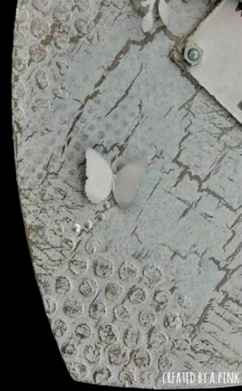
I began by priming the mdf heart with a coat of gesso and then decided on my colour palette. I strayed away from all the craft branded paints we all know and love and used instead a Laura Ashley emulsion paint,Pale Duck Egg Blue as the main colour accented with Daler Rowney Silver acrylic paint and Tim Holtz Hickory Smoke distress and archival inks. 
The crackle medium that's created those lovely cracks is Paper Artsy Crackle glaze. I also used Paper Artsy Grunge paste to create the texture, applying it through Tim Holtz bubble layering stencil. I love working with Grunge paste as it seems to be that bit thicker than other pastes I have used which I find helps reduce the risk of any seepage under the stencil when applied. I also love the rougher, grungier look it gives especially when enhanced with inks or gilding wax, in this case both.

Extra detail is created with a fine hand script stamp in Archival ink and some distress ink stencilling using Tim Holtz dot fade layering stencil. Notice the butterflies too with their liquid pearl trails. They are punched from card stock (painted the same colour as the heart) using a Martha Stewart punch. 
 The flowers, that give dimension to the heart, are die cut from more of the painted card stock using Spellbinders 'Bitty Blossoms'. I used Tim Holtz laurel punch to create the leaves. I embellished the flowers with beads and added a few twists of silver wire. 
The quote , so meaningful and true, is from Wendy Vecchi stamp set 'Love to Make Art' and is stamped in Hickory smoke Archival distress ink.   Looks like the gem topped hex nuts have made an appearance again too- oops, you're probably tired of seeing them by now but I just think they add an extra touch of interest and make a lovely finishing touch. 
 And once again here is my finished hanging heart that is actually a touch bluer (but only a touch) than the lens would actually have you believe.
  I hope I have offered some inspiration for Astrid's 'Embossing pastes/ texture challenge' and whether I have or have not be sure to pop by A Vintage Journey to see lots of inspirational projects created by my fellow Creative Guides.
We would love for you to join in the challenge so as Astrid says 'put your mixed media hats on and go create some magic'. We look forward to seeing your entries . 

I would like to enter this into the following challenges 
Simon Says Stamp Monday Challenge - Monochrome 
Mixed Media Monthly #25- 2nd Anniversary 
(#18 Texture, #23 Dimension and #19 Silver and Gold) 
The Craft Stamper TIMI Challenge : June 'Lets get Inky'    
Stamps and Stencils - Challenge-  Floral Frenzy
Frilly and Funky - Challenge: Let the Words do the Talking  
Country View Crafts Challenge: Crackle
 
Thanks for taking the time to pop by today. Its always a pleasure to have you visit. 
I look forward to seeing you all again soon 
Have a lovely weekend 
Take care 
Amanda 
xxx